UX/UI Design
C More
- Role
- UX/UI Designer
- Platforms
- iOS, Android
- Discipline
- UX/UI Design
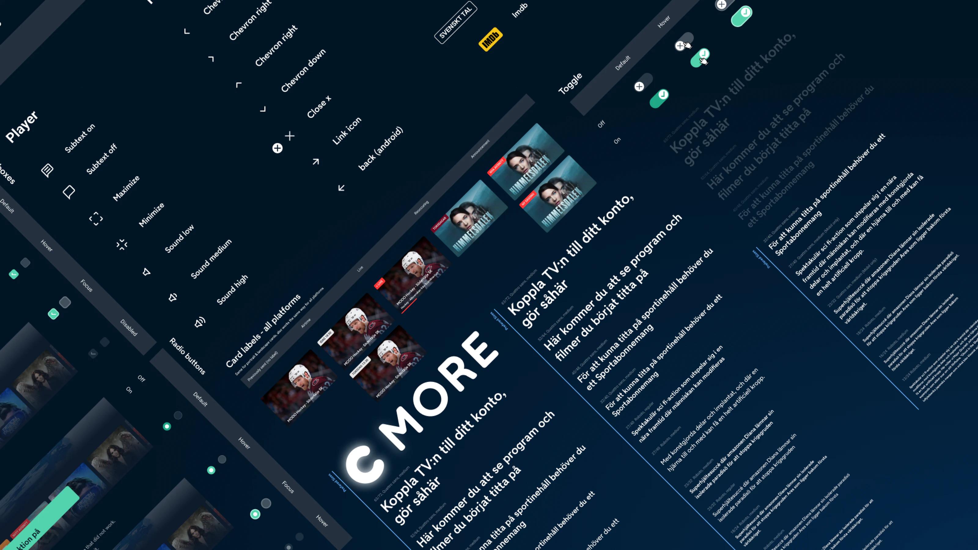
What is C More?
C More was Bonnier Media's streaming platform, with everything from live TV and sports to reality series.
Context
A rebrand and a rebuild at once
C More changed its main colour from black to blue to stand apart from competitors like Viaplay. At the same time the iOS and Android apps were being refactored, and the UX felt dated. Together, that became a full redesign around the new graphic profile.
From hamburger to tabs
My brief was to replace the hamburger menu with tab navigation. I ran small workshops with the design team on how content should be grouped, and worked with stakeholders from product and tech to the sports department and web editors.
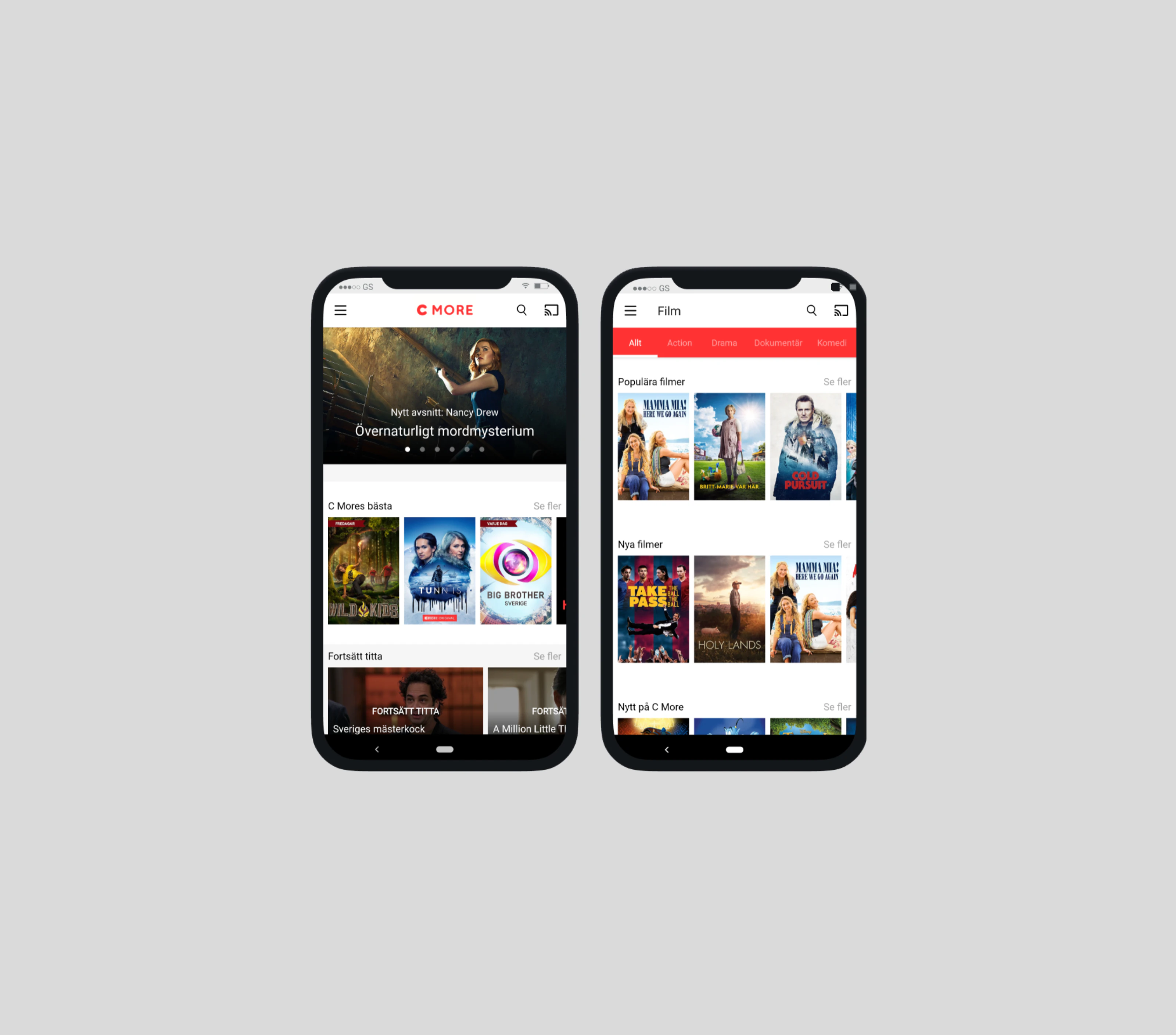
Old design - Hamburger navigation
Role
Navigation and beyond
I designed the new navigation as well as CDP, Sports and Offline, covering both UX and UI. My team was a product owner, two developers each for iOS and Android, and a contact in the editorial team.
A shared design system kept the designers aligned: when I needed a new component I designed it, and the system's owner approved it.
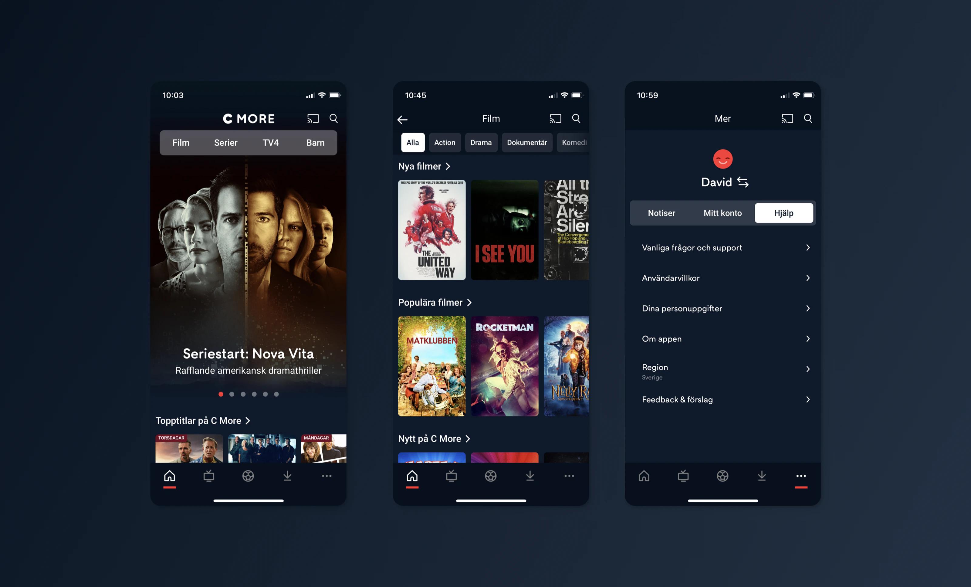
Final design - Navigation
Process
Letting the data fill the start page
The data team built a GA dashboard showing what people actually watched. It swung a lot by day and audience: sports dominated when the national team played and almost vanished otherwise. So the start page was built around the most popular genres.
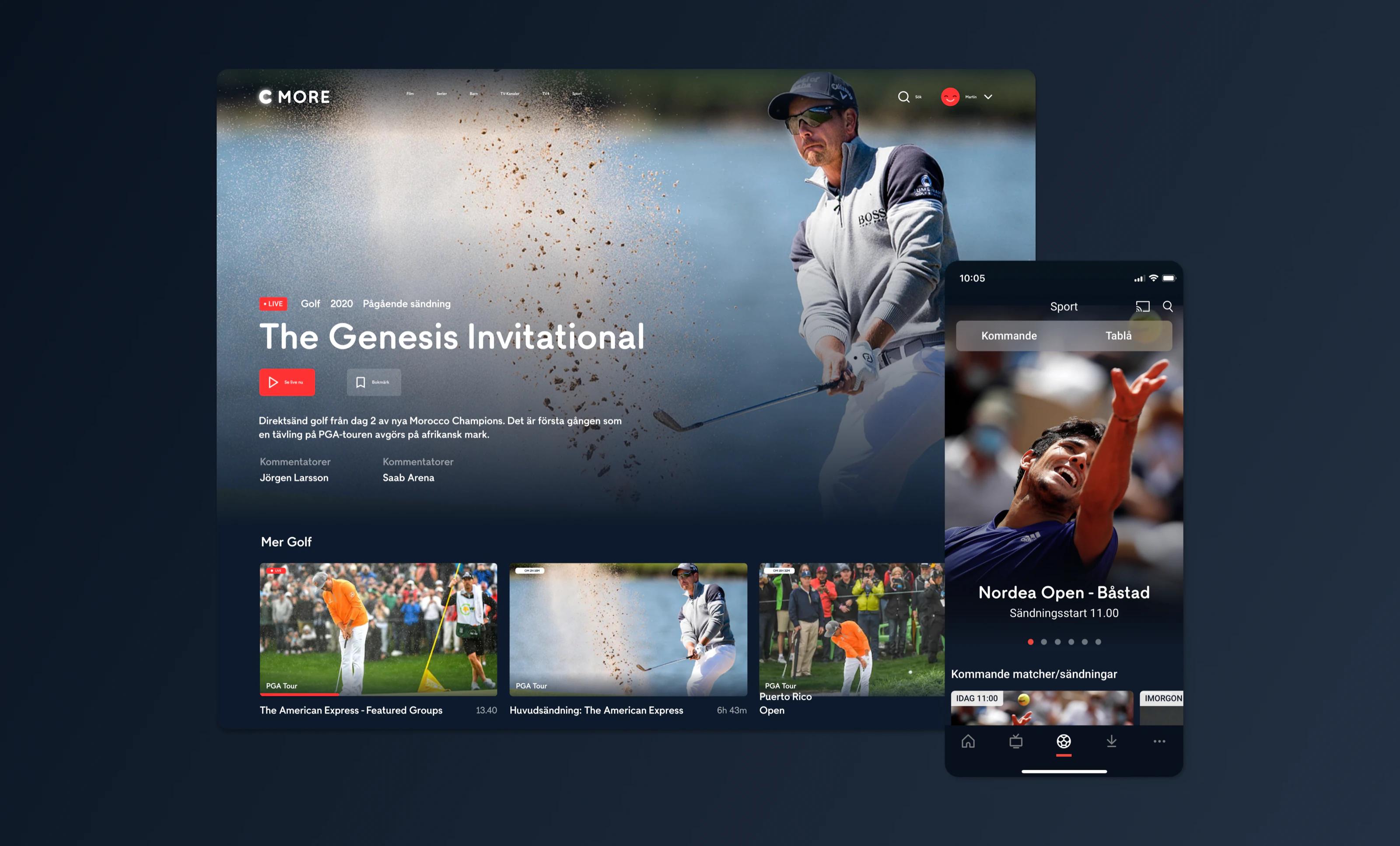
Final design - Sports
Outcome
Modern design, modern tech
We reached both goals, a modernised design and updated tech, with good feedback from users and within the organisation.
Big strides in a short time
After a few early bumps, the whole team pulled in the same direction and got a lot done in a short time. The cost was research: our researcher had been let go and the attitude was "get things done". That helped C More take big strides, but a project this size should ideally have had a proper research phase.